Create a Mobile Responsive Menu

1. Create Your Menu
- Step 1: Go to the WordPress dashboard.

- Step 2: Navigate to Appearance > Menus.
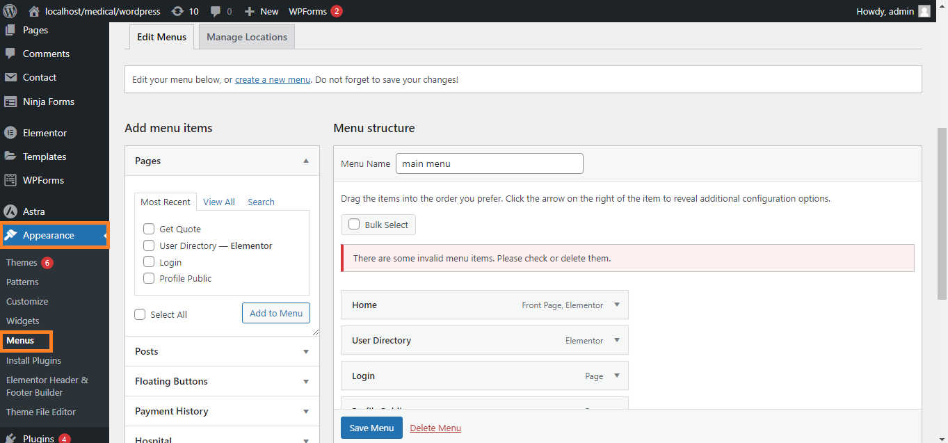
- Step 3: Click on Create a new menu.

- Step 4: Add the pages, posts, or custom links you want to include in your menu.

- Step 5: Arrange the menu items by dragging and dropping them into the desired order.
- Step 6: Assign the menu to the proper theme location (e.g., Primary Menu).\

2. Use a Menu Plugin (Optional)
- Step 1: If your theme doesn’t support a responsive menu, install a plugin like Responsive Menu or Max Mega Menu.
- Step 2: Go to Plugins > Add New and search for the plugin.
- Step 3: Install and activate the plugin.
- Step 4: Configure the plugin settings, where you can customize the appearance and behavior of the mobile menu.

3. Customize the Mobile Menu
- Step 1: Go to Appearance > Customize.

- Step 2: Navigate to the Menus section.

- Step 3: Look for a section specifically for mobile menus, where you can adjust how the menu looks and behaves on mobile devices.
- Step 4: Some themes allow you to enable/disable features like the hamburger icon, dropdowns, and sticky menus.

4. Test Your Mobile Menu
- Step 1: After setting up your menu, test it on various mobile devices to ensure it functions correctly.

- Step 2: Use Chrome Developer Tools (Right-click > Inspect > Toggle Device Toolbar) to simulate different screen sizes.

5. Add Custom CSS (If Needed)
- Step 1: Go to Appearance > Customize > Additional CSS.

- Step 2: Add custom CSS to further tweak the menu’s appearance if required.

6. Save & Publish
- Step 1: After making all changes, save and publish your menu.
Following these steps will help you create a mobile-responsive menu in WordPress, ensuring that your website is easy to navigate on any device.


